We had the pleasure of doing the branding for the most famous bakery in Spain. From the beginning, their goal was clear: they wanted to show that they are the best in their field. They asked us for packaging that was wild, fun, eye-catching, and interactive—full of design from every angle.
They wanted to keep some of the colors that already represented their brand, like pink. With that as our base, we began building the entire visual universe. We adjusted the shades of pink and added blue and a cream tone to create more contrast. Then we introduced light blue and lilac to bring even more life and freshness to the palette.
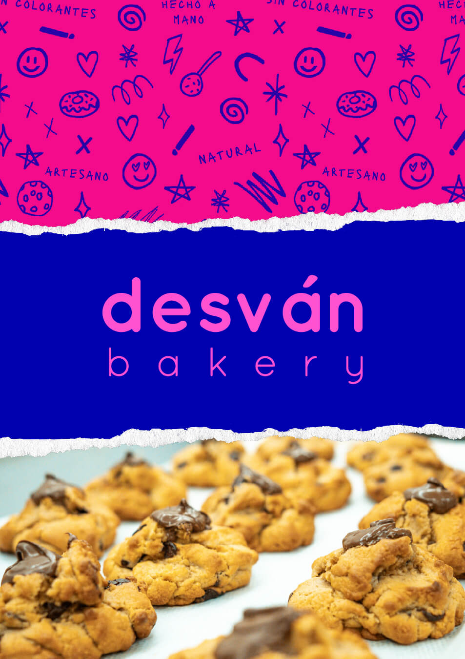
When reviewing their previous visual identity, we noticed several elements that could be improved—especially the logo. Visually, it didn’t highlight the brand’s real name, El Desván. So we decided to give the name center stage, using the word “Bakery” as a secondary tagline. The result was a more minimalist logo that breathes modernity and youth, combined with the urban and playful character that defines the brand’s new identity.
Logo
#2305A0
RGB: 35, 5, 160
CMYK: 100, 93, 3, 1
#4OC8C
RGB: 244, 12, 140
CMYK: 0, 93, 0, 0
#FF6ECB
RGB: 255, 110, 203
CMYK: 10, 66, 0, 0
#FCFCF2
RGB: 252, 252, 242
CMYK: 2, 0, 7, 0
#B6A1F7
RGB: 182, 161, 247
CMYK: 37, 40, 0, 0
#3DB6F9
RGB: 61, 182, 249
CMYK: 65, 13, 0, 0
Graphic resources
Typography
Social Media
Photography
Boost your business today
Dare to give your business a twist so that everyone likes your new version, even your competitors 😛